Entering a salon can be a confronting and awkward experience. Typically, clients enter into the heart of the working space, where hairdressers cut, dry, sculpt and colour clients’ hair to transform or refresh a look. In this situation, it’s hard to know where to wait, who to look for or what to do. You might even begin to question your choices: Can I really pull off a bob? The Disco Salon refutes this experience. Architect Jared Webb of recently established J.AR Office has created a space of muted colours and textured planes that choreographs a sequence of services to ensure the only question clients need to ask is: Can I have more champagne, please?
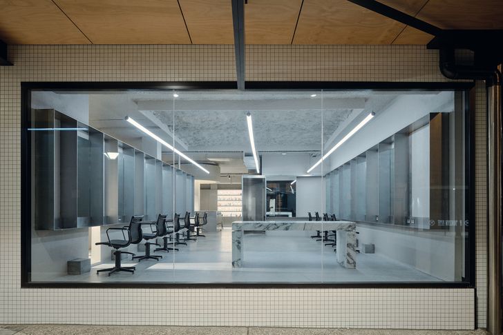
Nestled among an eclectic array of retail in Brisbane’s gazetted suburb of Stones Corner, The Disco is certainly the most refined tenancy on the strip. It is a space that is effortlessly elegant, receding into the background to hero the tenant’s brand and services. Mikey Forster, Webb’s client, is well known in the salon world as a colourist – a skill that seems to have been a driver for the design direction. “The fitout is pared back, but the [salon’s] actions populate it,” says Webb. The interior becomes a backdrop against which to demonstrate the art of cutting and colouring hair. This purpose is clear in the space Webb and Forster call the “disco room,” where stainless steel joinery, bright cool-toned lighting and polished concrete floors evoke a showroom-like feel. The deliberately subdued palette contrasts with the colourful dyeing process, turning the latter into a display-like focal point in the shopfront window.
The Disco is designed to be a stage for the street, the artistry on show for the pedestrians.
Image:
David Chatfield
“A salon is a public project, [but] it’s also private,” Webb says. “There’s not too many programs where someone comes in and sits in [a] space for three to four hours. So then I started to think, all right, what would I be looking for [during that time]?” While the materiality and minimal palette of the “disco room” carry throughout the fitout, there is variation and intrigue for those who look for it. Curious moments are created through the combination of geometry, texture, light and shadow: Repetitive rectilinear joinery slices light onto surfaces in angular arrays. Mirrors have been positioned to create an illusion of infinite reflection, and little nooks offer glimpses through joinery that reveal other spaces. These details slowly unfold, bringing gentle variety into the space while defining interior zones. “Each zone speaks to a key service [the salon] provides, instead of being a single experience for the whole space,” Webb says.
These zones are choreographed moments of compression and release that control the functionality of the salon and simultaneously elevate the experience of luxury.
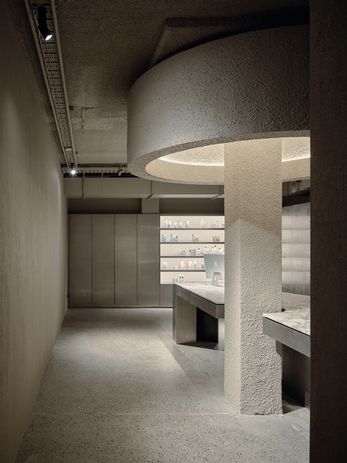
The marble island reception desk is haloed by a custom-designed ceiling sculpture that acts as a centre point.
Image:
David Chatfield
From the point of arrival, guests know it’s “me time”: A narrow corridor immediately dampens the outside world with soft coir carpet, dimmed warm-toned light and cool air wafting the salon’s signature scent. The corridor opens up at the marble island bench, which is anchored by a textured square column and circular overhead form.
This zone has the persona of a kitchen island bench – it’s a social space that embraces mess and chaos by showcasing the colour-mixing skills of the owner and staff while supporting the myriad interactions of a hair salon. Clients are then guided to the waiting area or offered a chair in the bright disco room; for those scheduled for a shampoo, a curved metal wall continues to a small, quiet washing room.
The success of the design is in its ability to use pre-existing parameters and constraints to its advantage. Webb has transformed stock standard elements – columns, a ramp, a square floor area – into a hard-working, sculpted, sensory space. The Disco intentionally foregrounds the creativity and expertise of the salon’s staff without compromising functionality or visitor experience for what is, ultimately, a space for salon guests. The curated palette and considered layout allay social anxieties, allowing each individual to focus on being their best and, maybe literally, brightest self.


