In the famous fifteenth-century painting La Città ideale di Urbino , a rotunda sits symmetrically on rigorously paved ground, with a harmonious backdrop of palazzi. 1 It’s one of many utopian visions that propose rational, human-scaled architecture as key to civilized urbanity. Although it is 500 years and half-a-world distant from the project I’m standing in, it doesn’t seem that far away in intent, or critical moves. The Student Precinct Project at the University of Melbourne deploys the same tactics of organizing ground plane, centrality, view and perspectival drama, albeit in an energetic, messy varsity version and for a more inclusive understanding of humanity than Renaissance society encompassed.
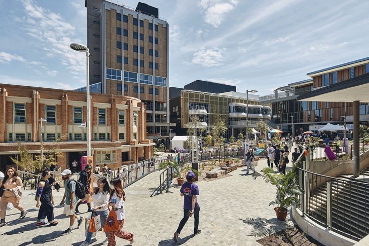
The site was radically excavated, in line with a 2016 masterplan by Jackson Clements Burrows Architects, to reveal its natural six-metre gradient.
Image:
Peter Bennetts
The principle of diversity underpins this massive project. Contemporary campus design is no longer the province of sole architecture practices, and the University of Melbourne recognized that with a competition brief for a near-whole city block redevelopment of 18,000 square metres, seven student facility buildings (including two libraries and two theatres), and 12,000 square metres of landscape, a multifaceted, collaborative team was vital to resist institutional homogeneity in the outcome. The winning team – of Lyons with Koning Eizenberg Architecture, NMBW Architecture Studio, Greenaway Architects, Architects EAT, Aspect Studios and Glas Urban – credits its success to prior achievements with RMIT University’s New Academic Street project (2017), which demonstrated the richness of a precinct designed by multiple voices with cooperative, creative autonomy. The team was assembled with expertise across different scales and foci – from the intimate, social emphases of Koning Eizenberg and Architects EAT’s work, to the placemaking proficiency of Aspect. Julie Eizenberg remarks that the extensive student consultation process revealed concerns about uniformity, gender differences and connection to nature. “Our team showed we could take on oddball parts of the brief, could attend to the holes in the environment, and could take on sustainability seriously,” she says (although she assures me that Lyons are “the most fun lead architects” she has worked with).
“Co-creation with the students” was one of the main tenets of the brief; others include “precinct scale, landscape-led” and “co-location of services.” This was a long-overdue project to respond to pedagogical and experiential shifts in tertiary education, and to upgrade facilities muddied by an agglomeration of ad hoc adaptations. A client representative at my site visit declared that the project had “exceeded expectations” – no small achievement given the complexity of the task and the COVID-affected construction.
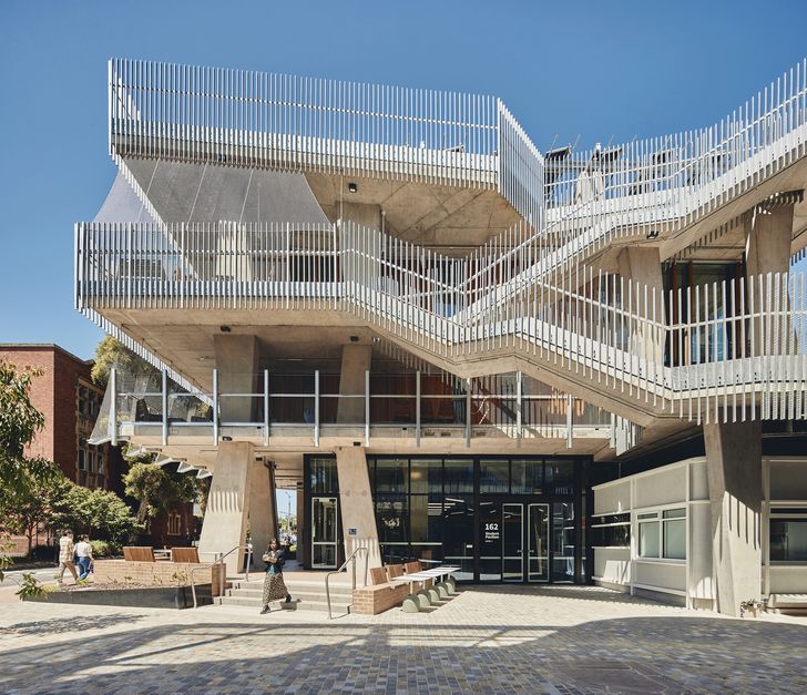
On top of the Student Pavilion, by Koning Eizenberg Architecture, students have access to a kitchen and events venue.
Image:
Peter Bennetts
The tenet of “reconciliation at scale” deserves particular mention, for both the ambitions of the University of Melbourne and the tripartite role of Jefa Greenaway as Indigenous knowledge broker to the university, interpreter of its Reconciliation Action Plan, and designer of architectural components within the scheme. Working with Wurundjeri Woi-wurrung, Bunurong and Yorta Yorta Traditional Custodians, the university committed to the goal of “embedding in place” Indigenous connections at the outset. The Student Precinct Project is thus a signature project, advancing reconciliation within academia, from curriculum and policy to tangible physical moves. Based on thorough cultural mapping, consideration of the diaspora of First Nations people from across the country, and challenging issues such as the university’s colonial foundations, two tactics became fundamental: focusing on the primacy of Country, and revealing and remembering place. These are manifest across the project in the operational shaping of places for welcome ceremonies and centralized gatherings, the incorporation of commissioned Aboriginal designs in fitouts, and the planting of flora from all 45 Indigenous language groups represented in the university’s student cohort throughout the site. The final piece of the puzzle is Greenaway, NMBW and Glas’s Murrup Barak Melbourne Institute for Indigenous Development and Welcome Ground (to be completed in 2026), situated on the precinct’s southern boundary and linking to the city’s new Metro Tunnel infrastructure.
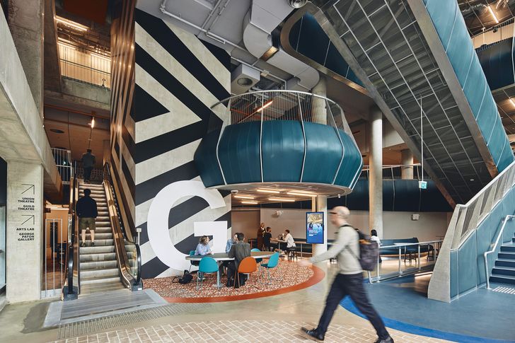
The Arts and Cultural Building has a particular focus on inclusion, with theatre spaces that welcome everyone, onstage and in the audience.
Image:
Peter Bennetts
And fittingly, it is from the ground up – and down – that respect for Country is most potent in determining the spatial disposition and character of the scheme. Lyons credits a 2016 masterplan by Jackson Clements Burrows Architects with the critical move to radically excavate the site, revealing and smoothing the natural six-metre gradient that had been obliterated over years of incremental development. At some $35 million, this was the costliest single move of the enterprise, but it enabled seamless accessibility between buildings, visual permeability and heightened views through the precinct, and a genuine connection to real ground.
Though the original watercourse of Bouverie Creek had long since been submerged, its environmental and cultural histories (including stories of migratory eels springing up on the vice-chancellor’s lawns!) became a further device for reinstating deeper links with place, and for practical measures of wayfinding and water management. Its path is traced across the surface of the site, inscribed in local mudstone, Castlemaine stone and granite, through buildings as organic shifts in floor level, and culminates in two ponds in the forthcoming Welcome Ground. Supported by native plantings and biodiverse landscaping, this move is an active archaeology of site, making natural systems visible even in the heart of urbanized Carlton.
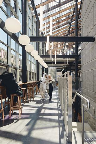
Lyons has integrated a new glass atrium into the 1970s Building 168, linking to the Eastern Resource Centre library.
Image:
Peter Bennetts
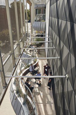
The suite of two new and five refurbished buildings make their own neighbourhood, around a large, informal amphitheatre, and the concept of theatricality infuses the architectural handling of most of the buildings. Extensive balconies, terraces and bridges erode the facades of the north and east backgrounds to the shared landscape, and provide everyday dramas of activity and visual exchange. As new additions to the precinct, Lyons’ cutting-edge Arts and Cultural Building and Koning Eizenberg’s ebullient Student Pavilion exploit this strategy spectacularly, with gold “scrim curtained” balconies and inhabitable mesh scaffolds, respectively. From these galleries, students can experience the life of the campus “in the round,” as the ground plane wraps up and through the buildings’ vertical streets, blurring boundaries between inside and out, between studying and relaxing, and between disciplines.
In fact, there are no discrete faculties here; instead, there is a generous cross-programming of facilities for the whole student population. Though some buildings – like NMBW’s sensitive renovation of the 1888 Building for graduate students, or their ingenious inside-out rejuvenation of the student union in Building 168 – are focused on specific groups, student experience is not limited within any single building. Nor is studying treated as an unsociable pursuit: 25 to 30 percent of the overall floor area is informal study space, or “Living Labs” for university research projects, often with commercial spaces (through Architects EAT’s perky hospitality pods and portals). And always connecting to outside and “the primacy of Country.”
“Reconciliation at scale” is one of the agreed commonalities across this otherwise eclectic assemblage of buildings. Unlike the unified geometry and materiality of La Citt à ideale , the tectonic languages here read like a visual essay of the past 150 years of architectural history. Given that refurbishment formed the major component of the brief, this mix of architectural personalities is understandable and sustainable, and respects the unique history of the University of Melbourne. The new and the old are kept in conversation through a general use of raw and robust materials – concrete, masonry, timber and steel – articulated directly or with expressive abundance in areas of high traffic, such as in the “hedgehog” soffit of the Student Pavilion bridge.
The facade of the Arts and Cultural Building is conceived as a “social scaffold,” providing another space for connection between people and with the site.
Image:
Peter Bennetts
One building strikes me as emblematic of the intelligent knit between the macro site strategies and the micro “lounge-away-from-home” ethos of the whole project, and it is – like many of the places here – casually unprogrammed. The 1939 Art Deco shell of Building 189, formerly known as the Frank Tate Building, 2 has been carved out to create a double-volume hall with a mezzanine and glazed loggias, openable to the surrounds and adaptable for temporary events, markets and amphitheatre overspill. Sensitive adaptation reveals the fine grain of the original, while a series of interspersed resin “Identity Bricks” subtly embed potent motifs and stories of reconciliation. With its bisque masonry and elegant composition, the pavilion recalls the rotunda of La Citt à ideale – a receptive, stable locus for activities yet to be imagined.
Urbino’s mythical city is devoid of inhabitants, almost like a prescient backcloth for an Instagrammable moment. As it awaits the start of the 2023 academic year, the Student Precinct Project has a similar quality: there are plenty of designed opportunities to capture nifty, enviable images of contemporary student life. And with its savvy eye on the importance of student experience, the university will no doubt be using social media to gauge the success of an investment governed by consultation, collaboration and ethical practice. By the time you read this, it might be worth searching for #lifeatunimelb or #studentlife to see how they’re doing.

